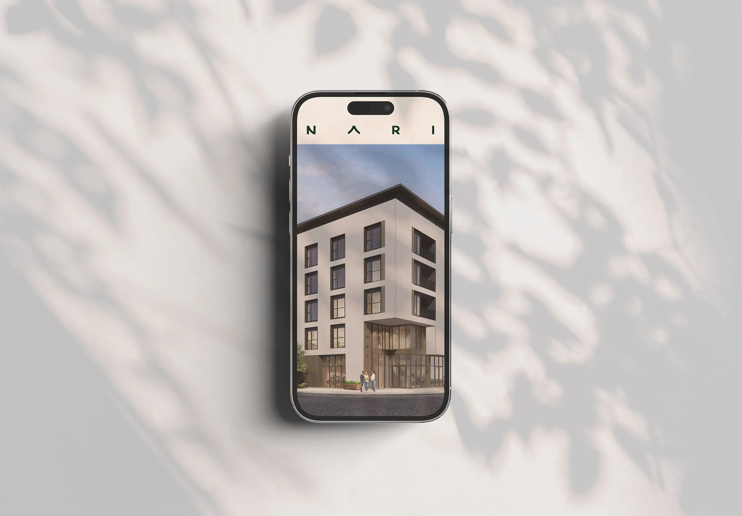
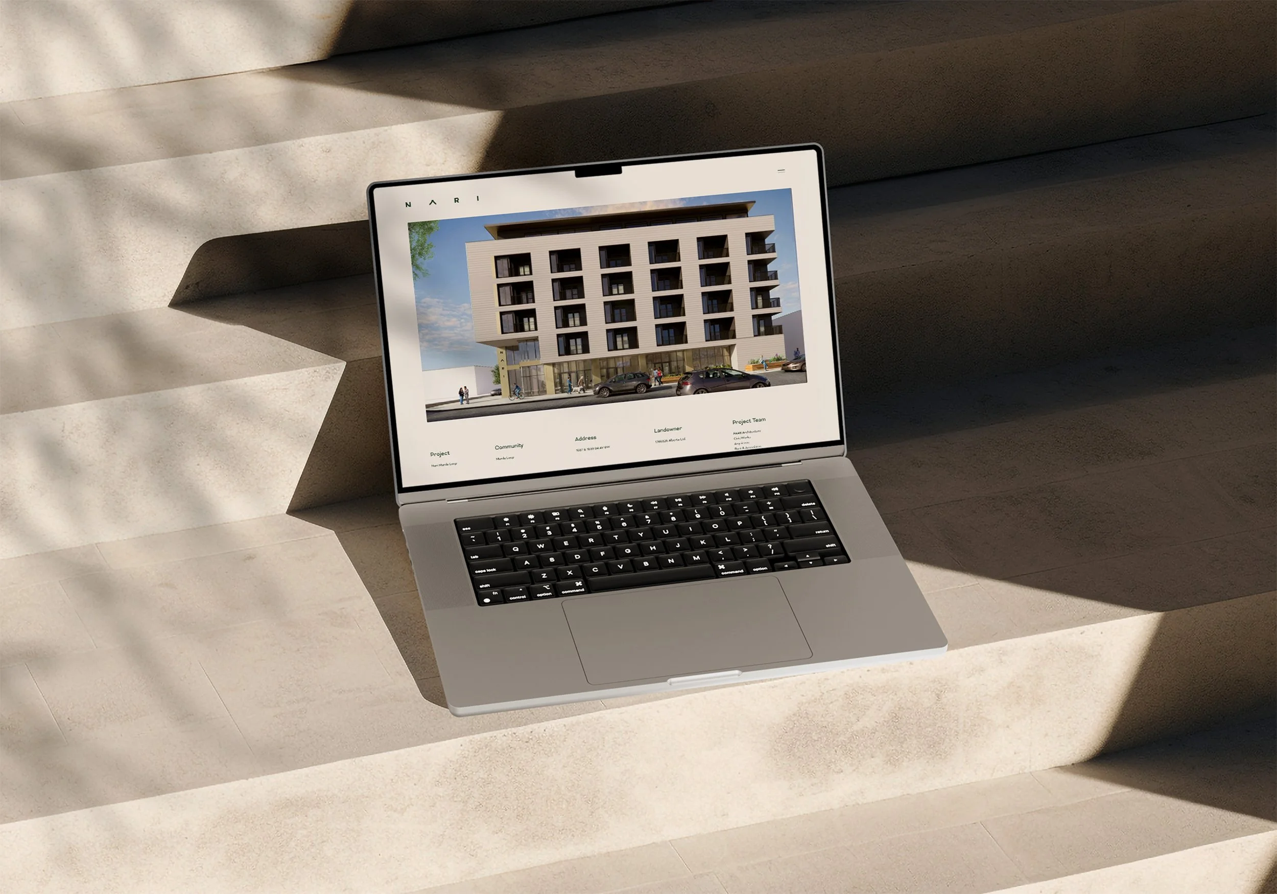
NARI
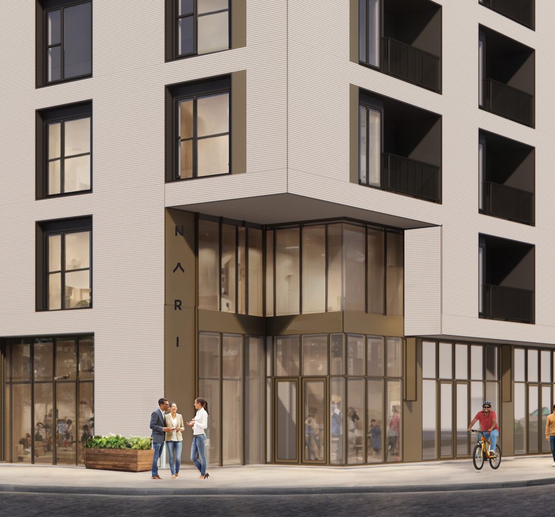
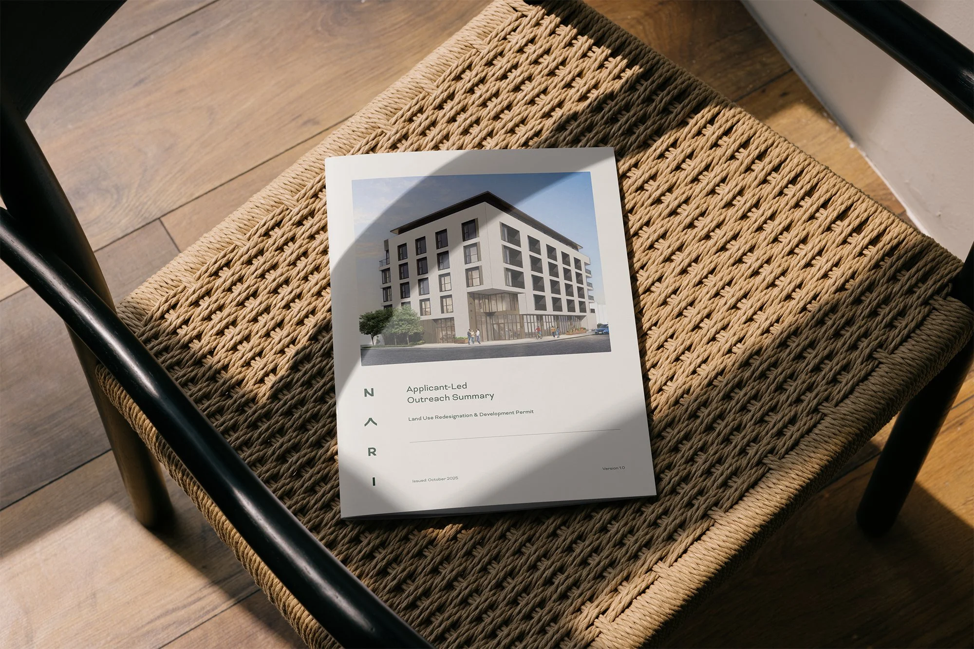
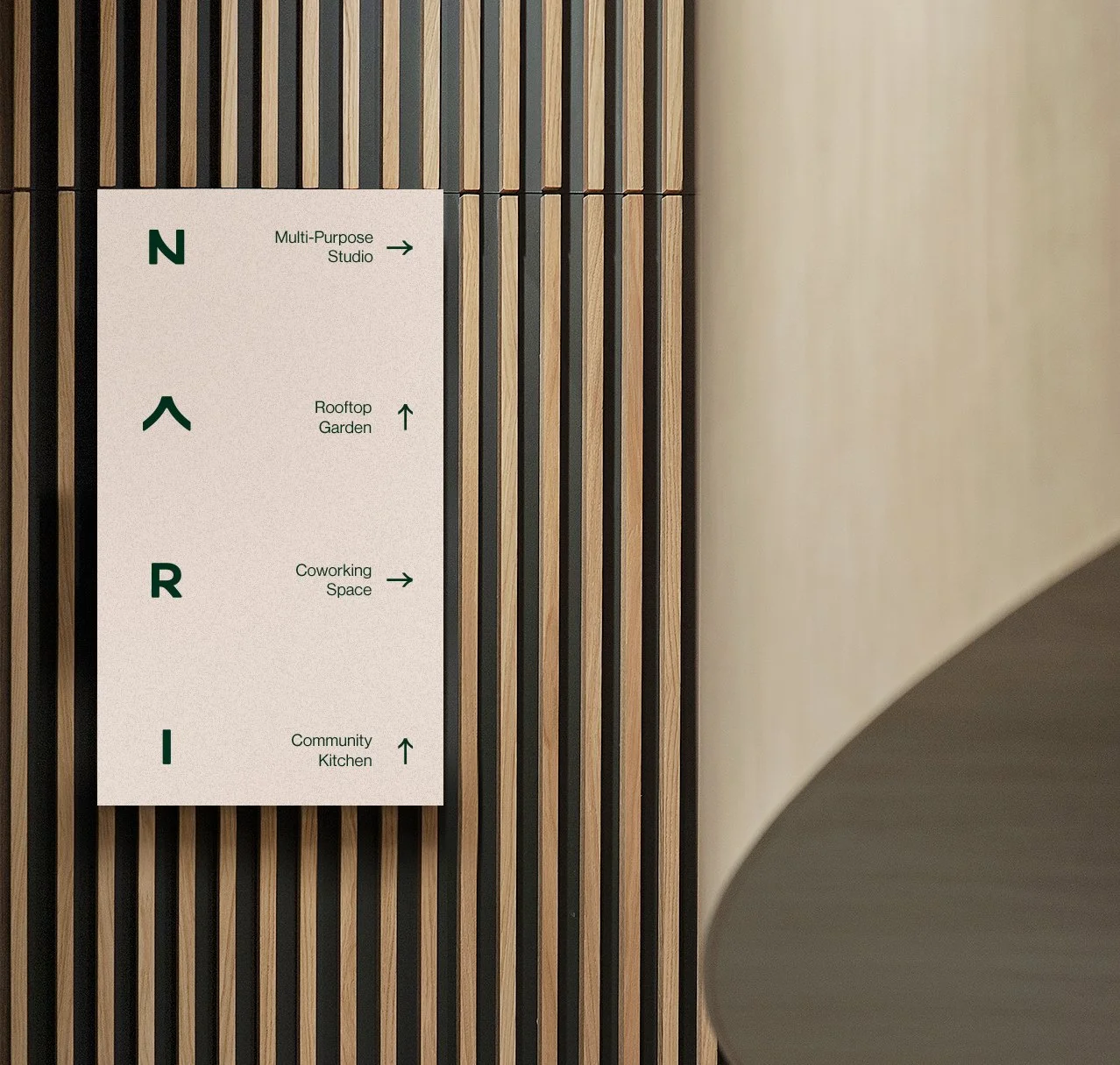
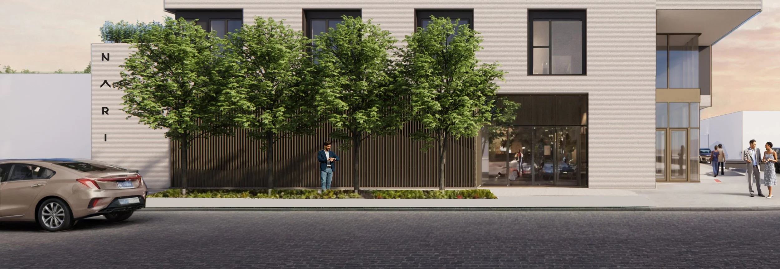
The design of Nari is guided by the idea of a well-lived life—one rooted in community, purpose, and contribution. Shared amenities such as a community kitchen, multi-purpose room, and landscaped areas inspired by Zen gardens are intended to encourage connection, relaxation, and a sense of belonging. These features reflect the project’s vision to be a place that nurtures both personal well-being and community life.
Brief
The client wanted an identity inspired by the principles of connection, purpose, and vitality. They asked us to explore conceptual references such as the Blue Zones, the enso of Zen Buddhism, and the philosophy of ikigai. The brand is conceived within a community that celebrates all ages, where older adults are fully integrated, and where the building itself symbolizes continuity, harmony, and a shared sense of belonging.
The Solution
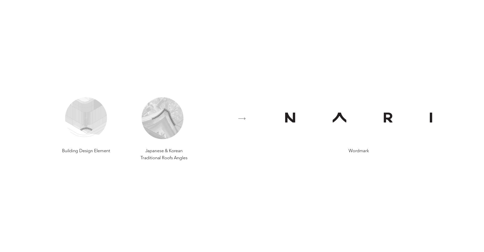
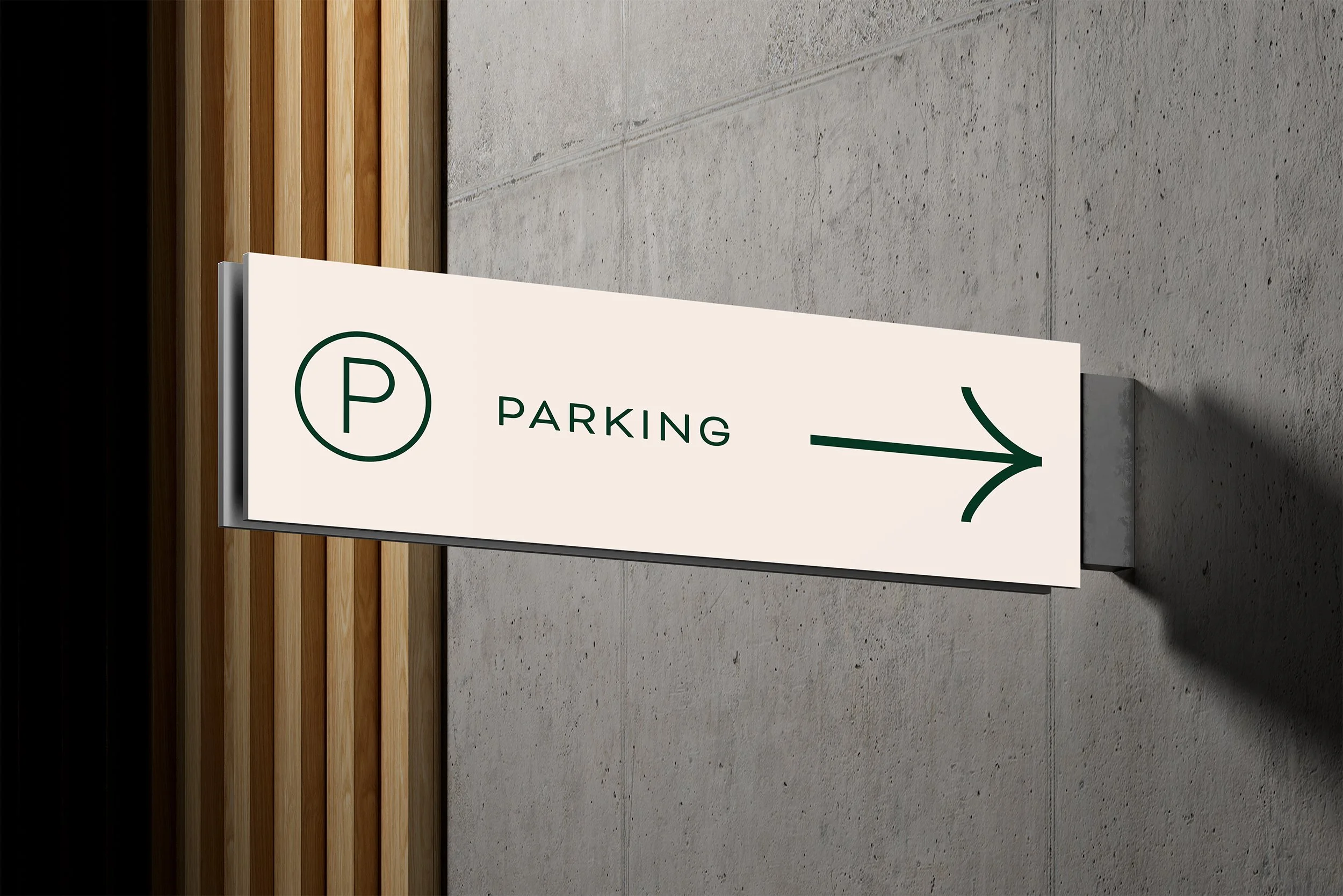
Wordmark proposal draws inspiration from the corner angles present in the building’s initial design concept, subtly reflecting the architectural lines that define its structure. It also echoes the sloping rooflines characteristic of traditional Korean and Japanese architecture, paying homage to their refined geometric forms. Additionally, the carefully considered spacing between the letters introduces a sense of calm, clarity, and balance, mirroring the harmonious principles found in both the Blue Zone concept and traditional Japanese and Korean architecture.
Services
Creative Direction, Brand Identity, Art Direction, Web design & Development
Breakdown
Applications
More Projects
View Project
View Project
View Project
View Project

