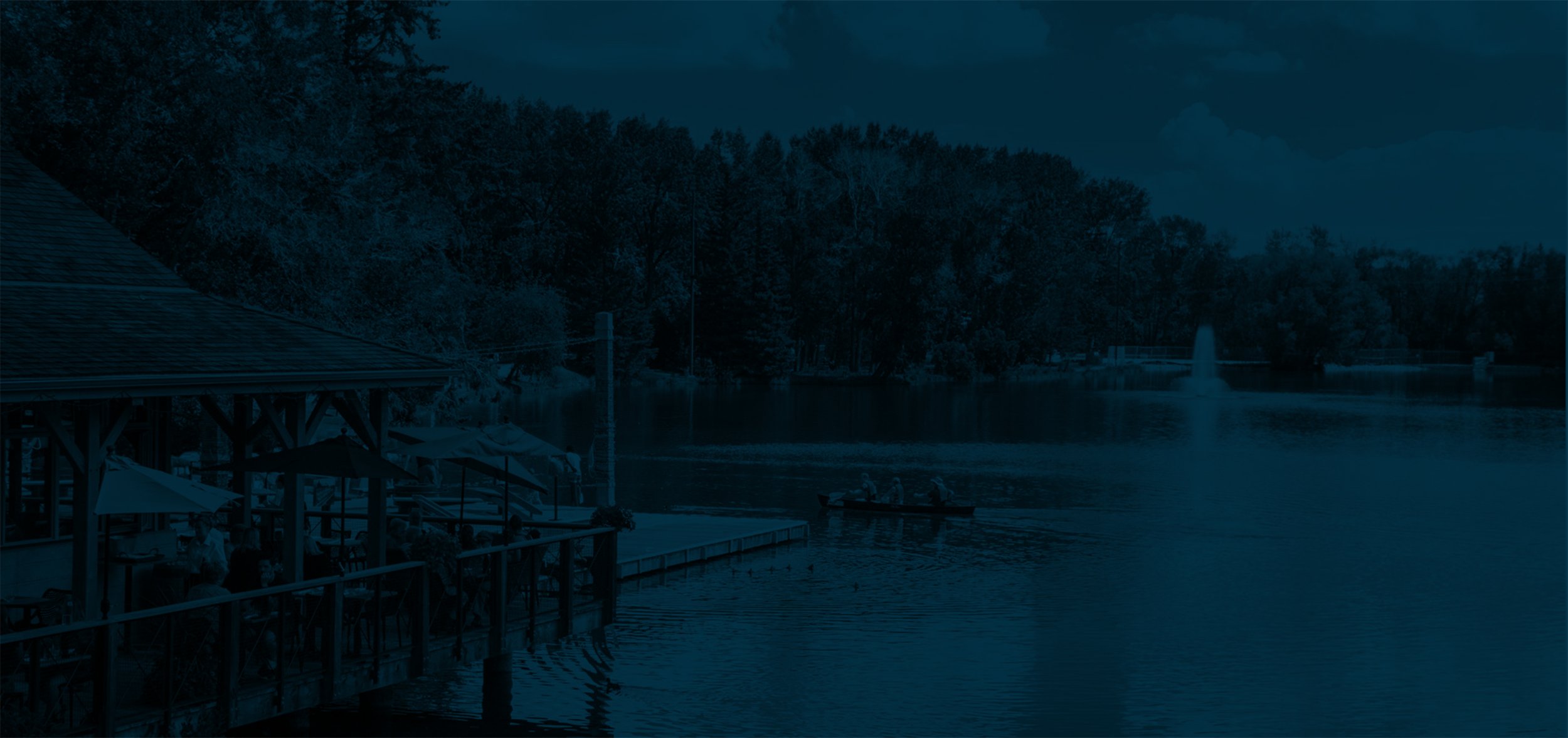
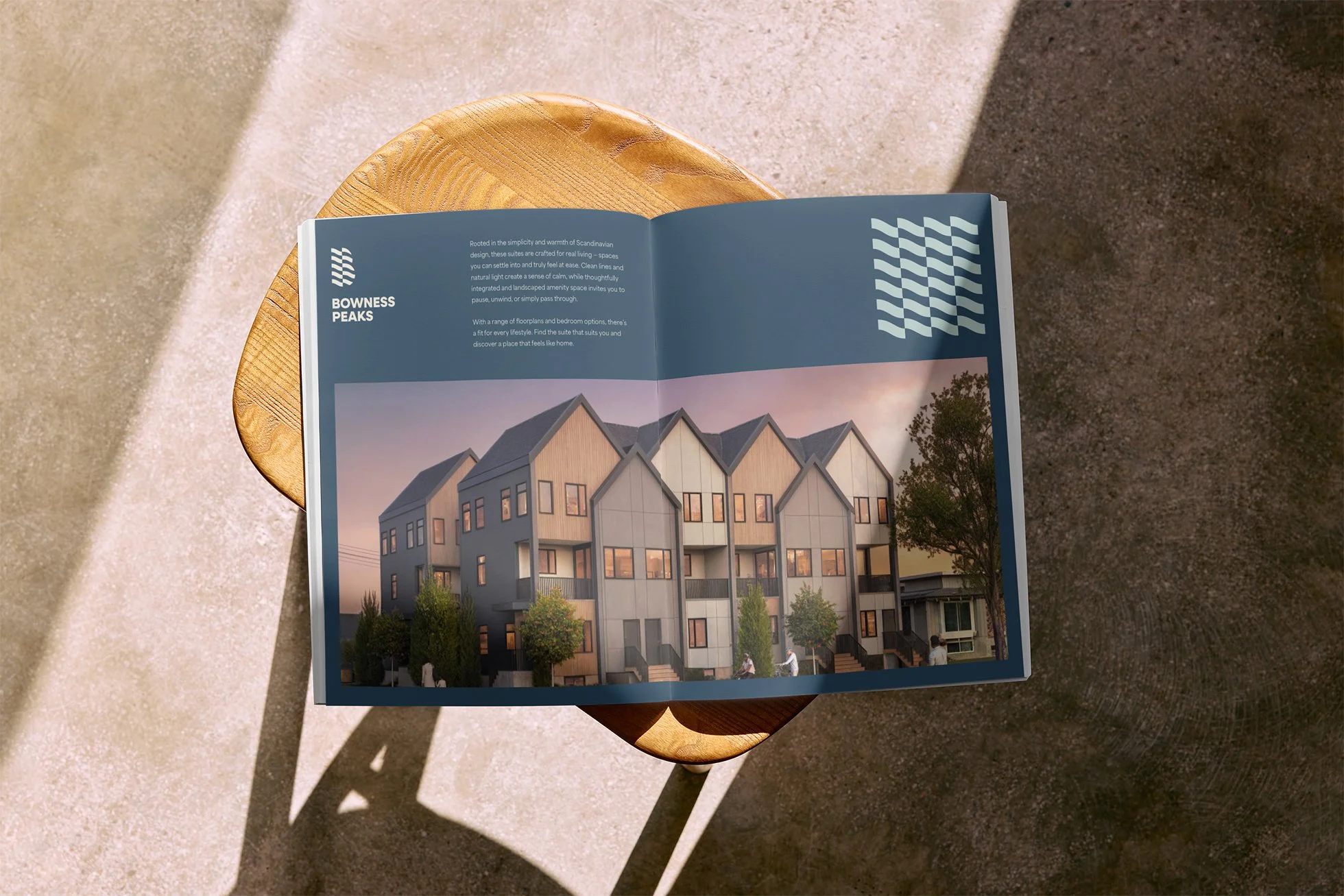
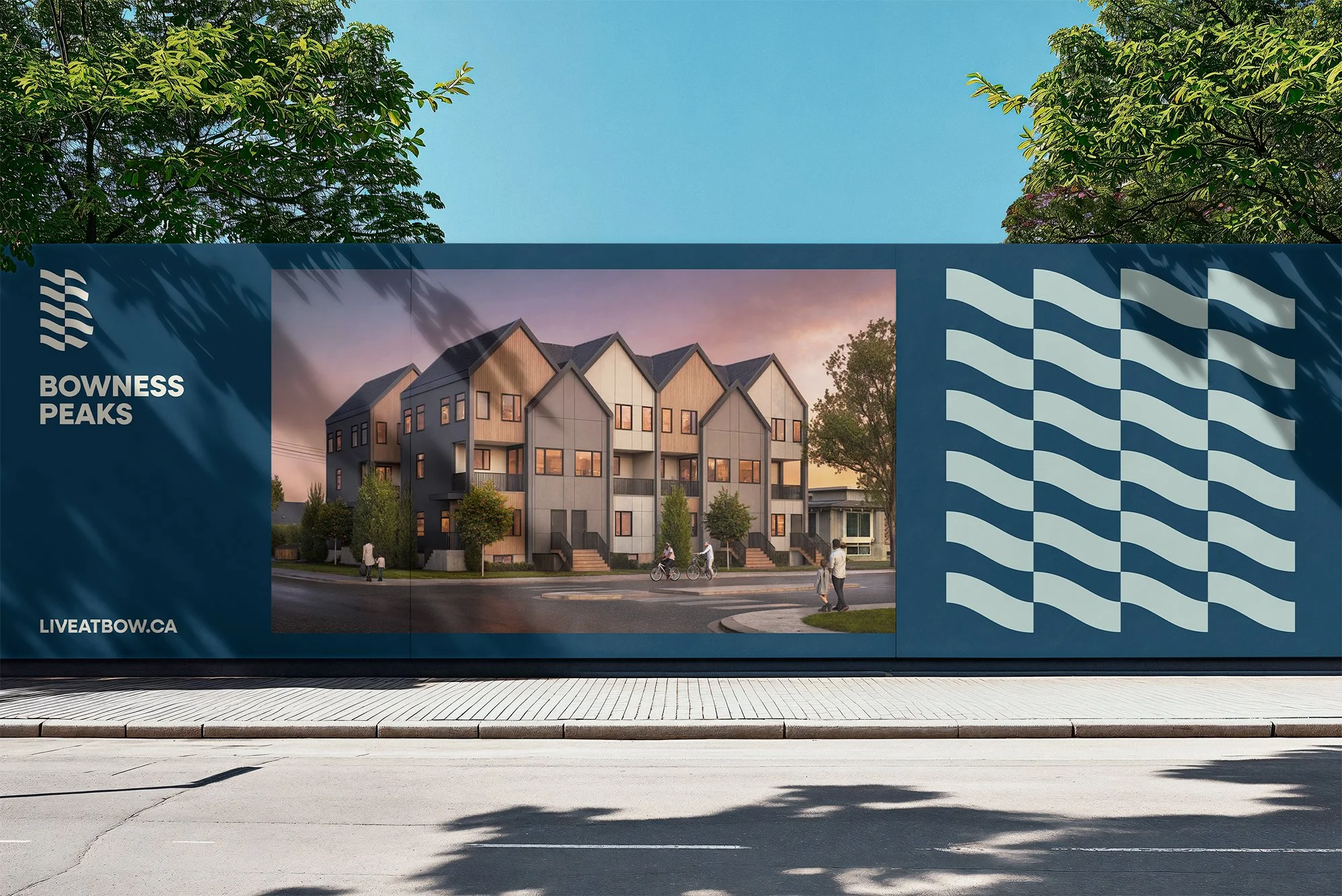
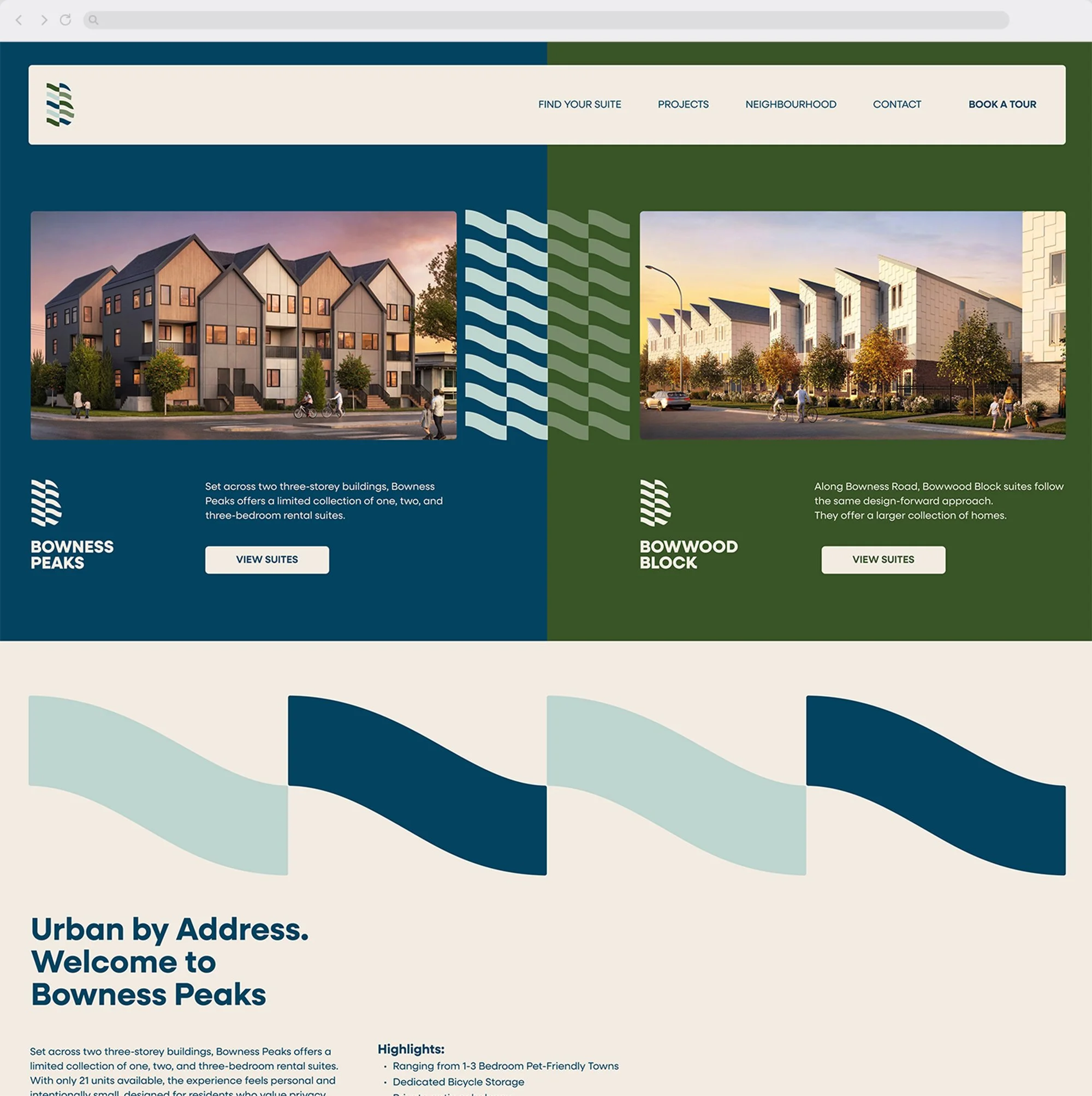
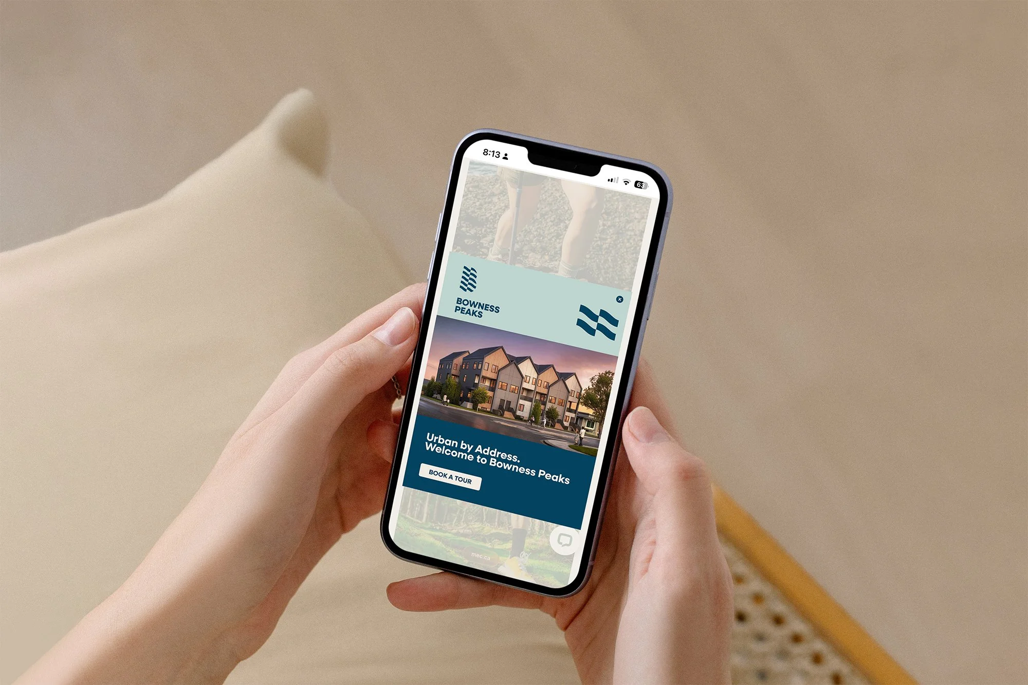
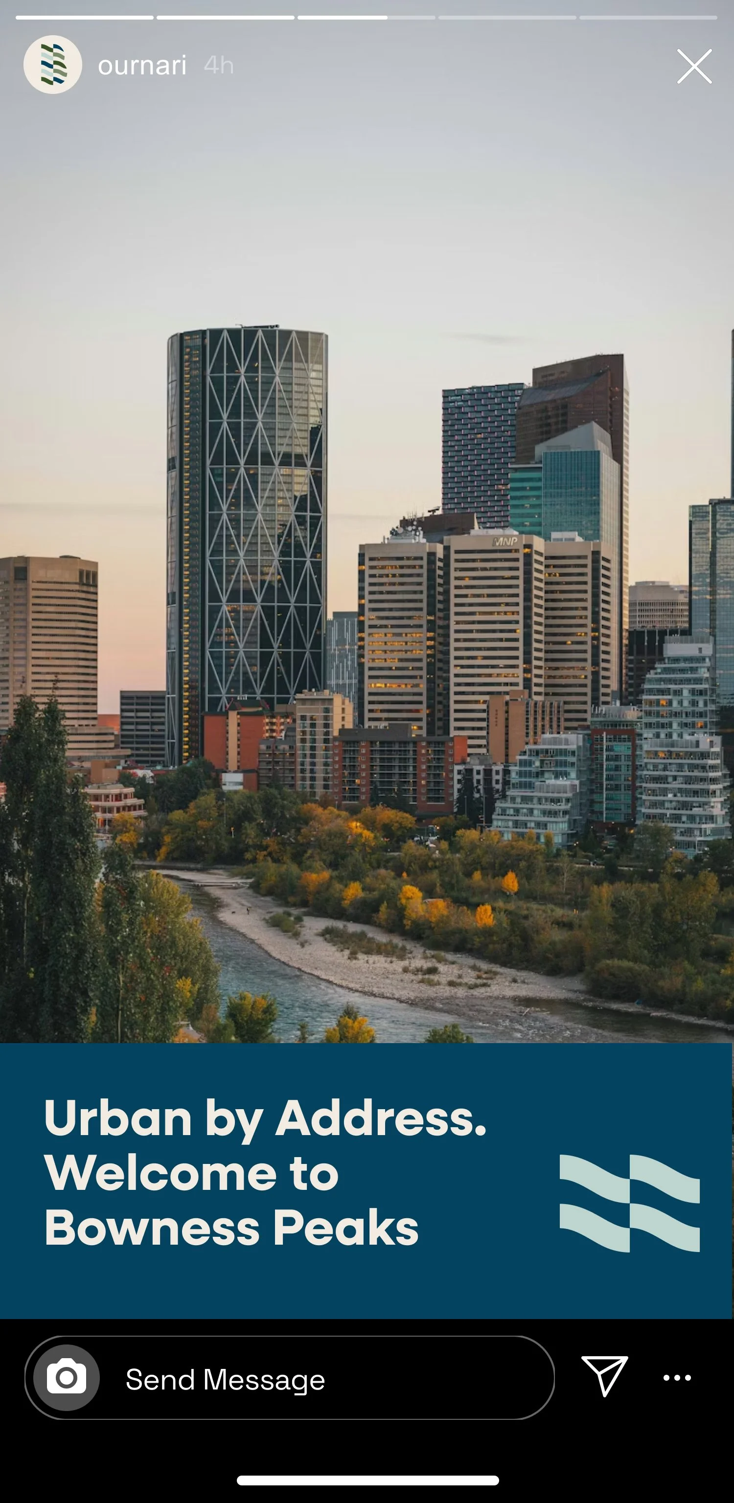
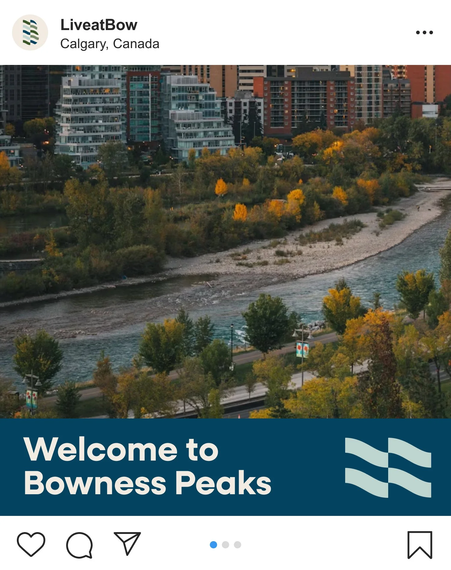
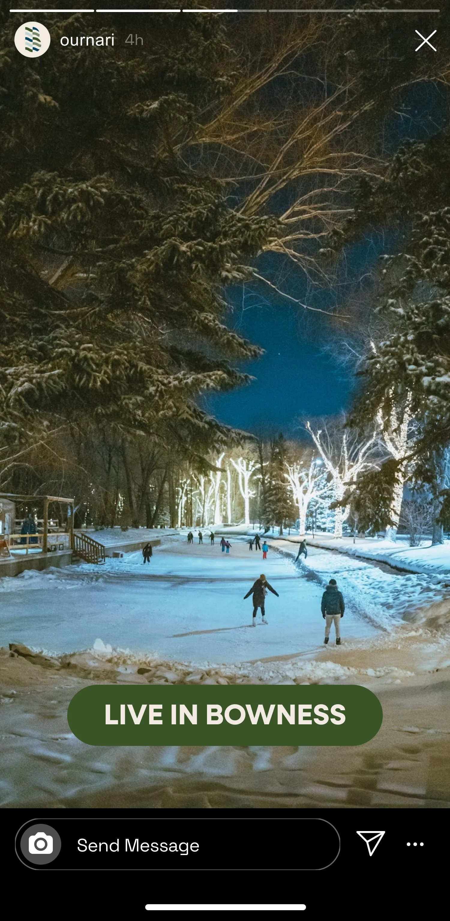
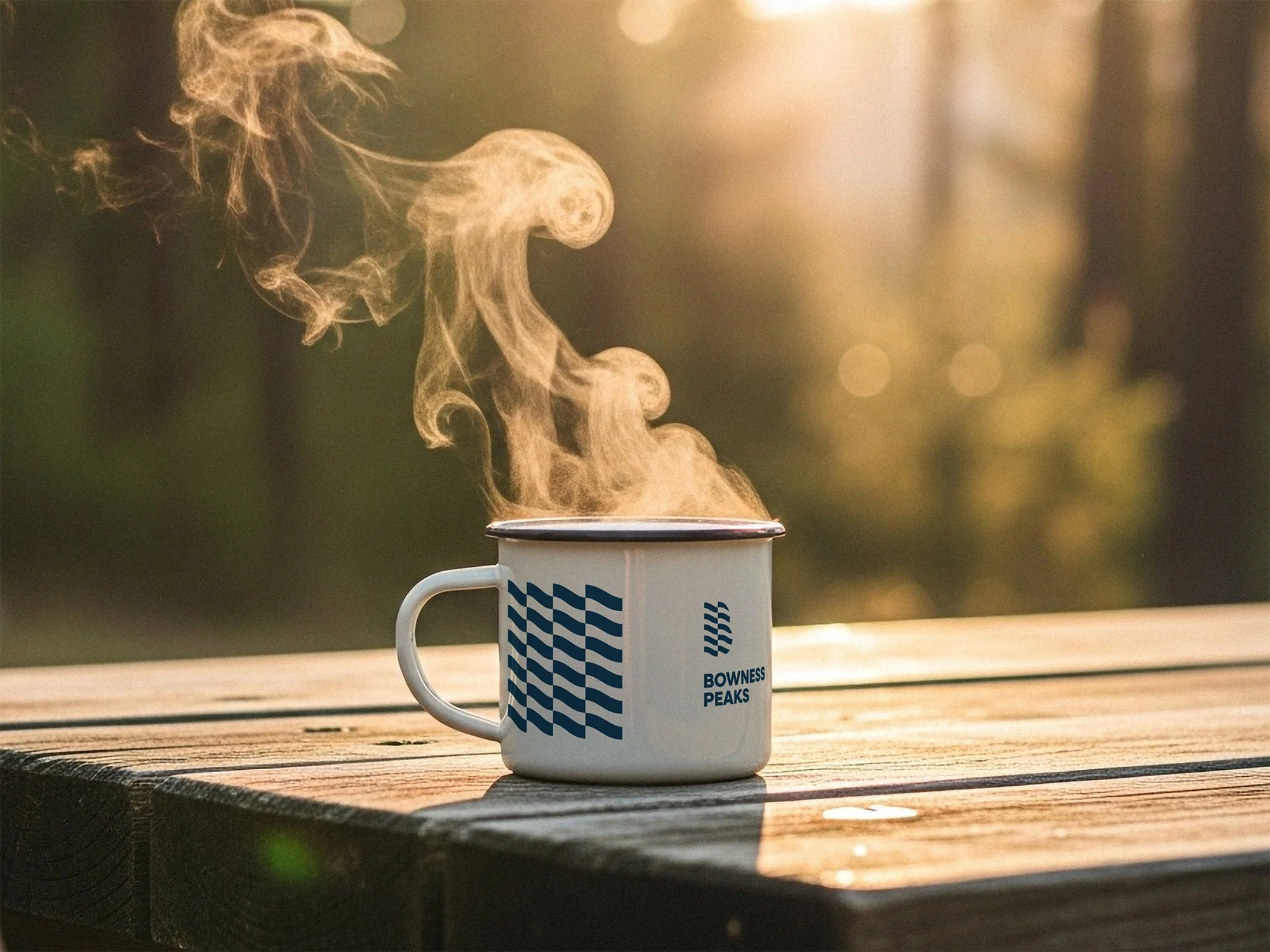
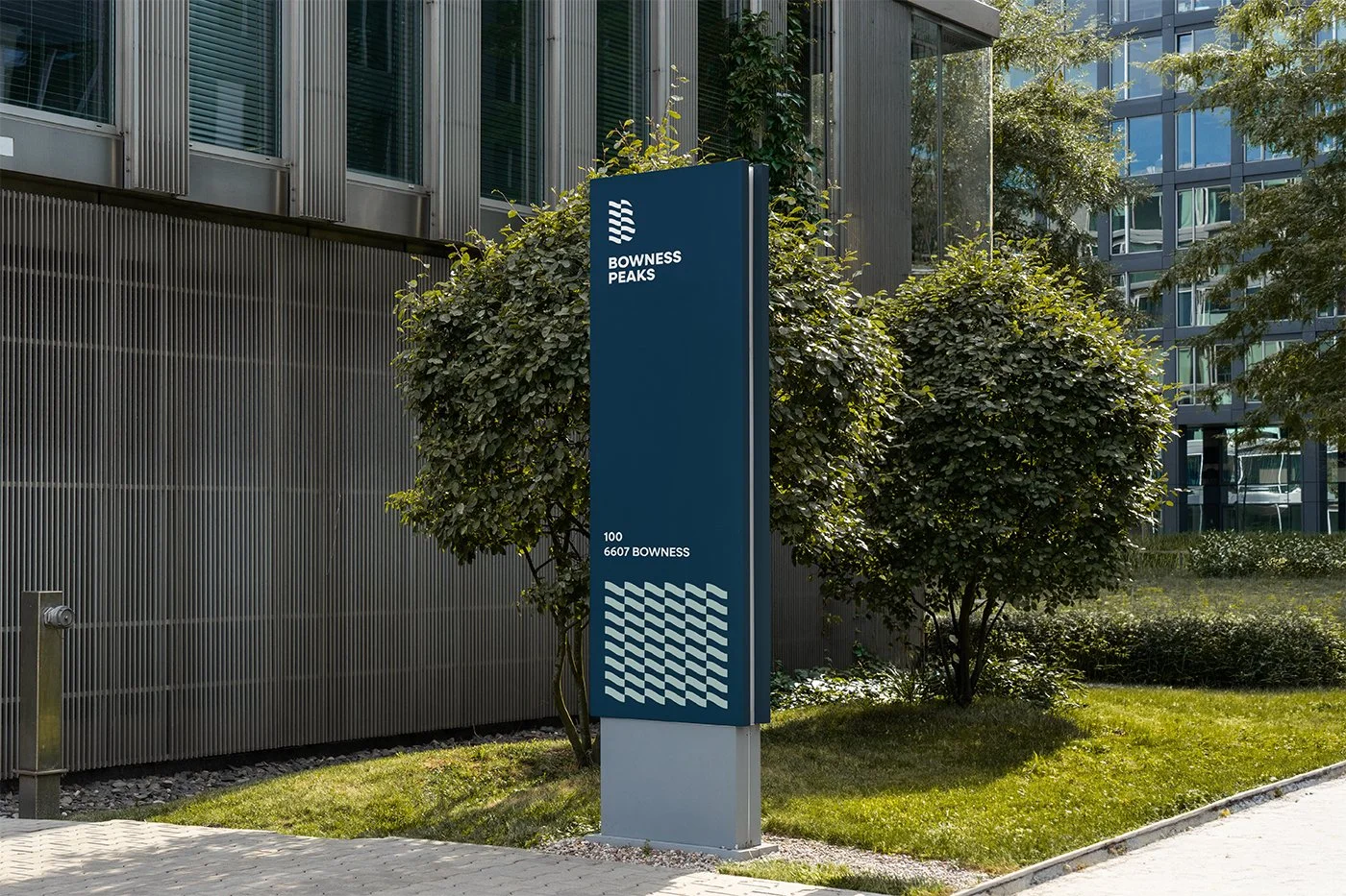
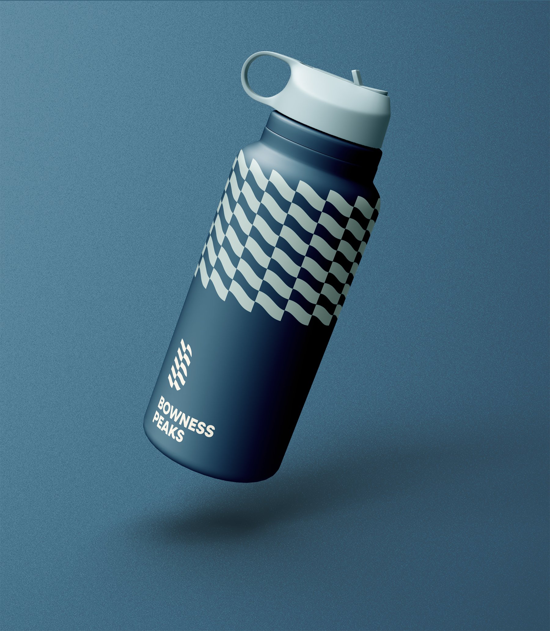
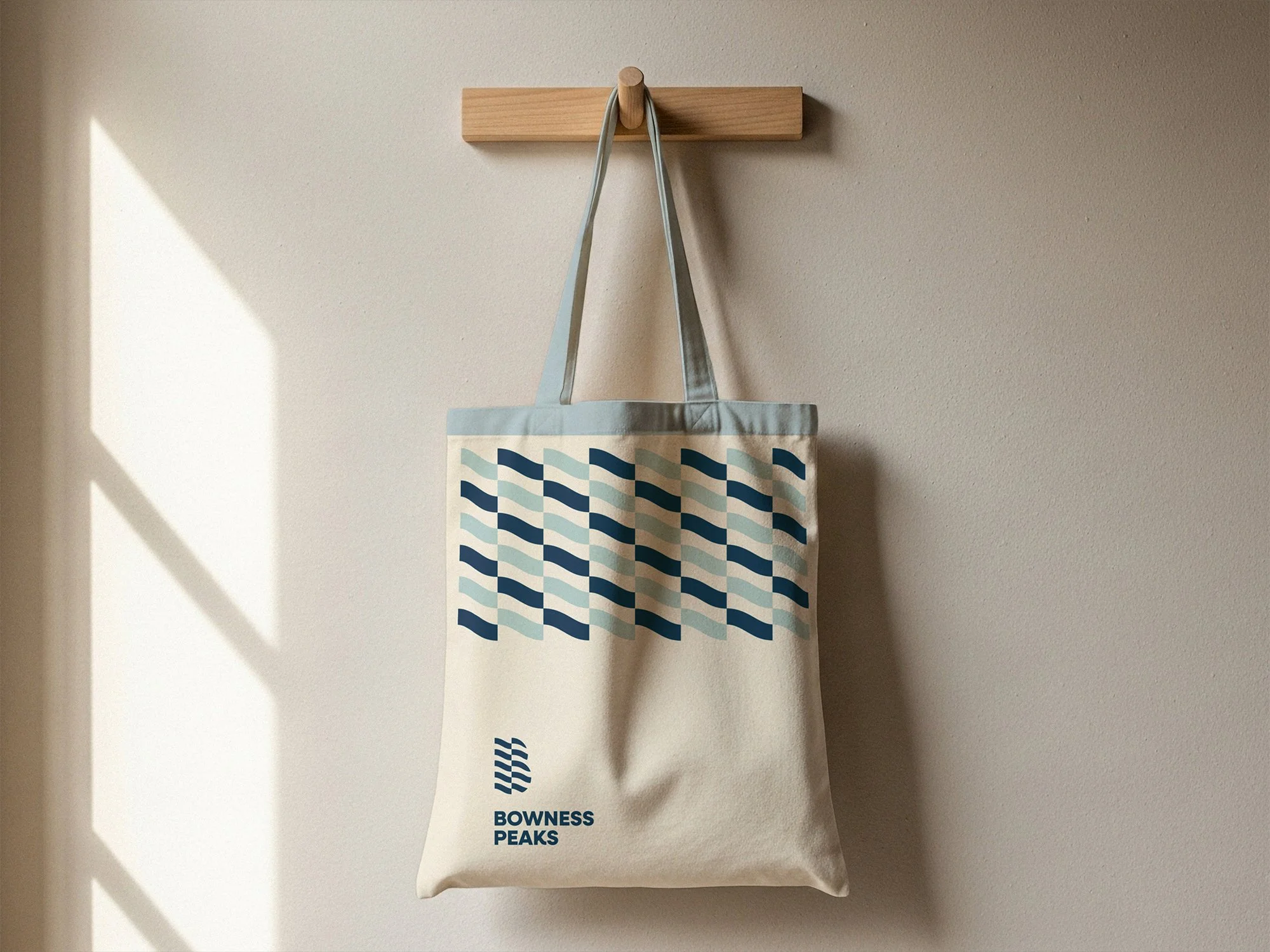
Bowness Peaks
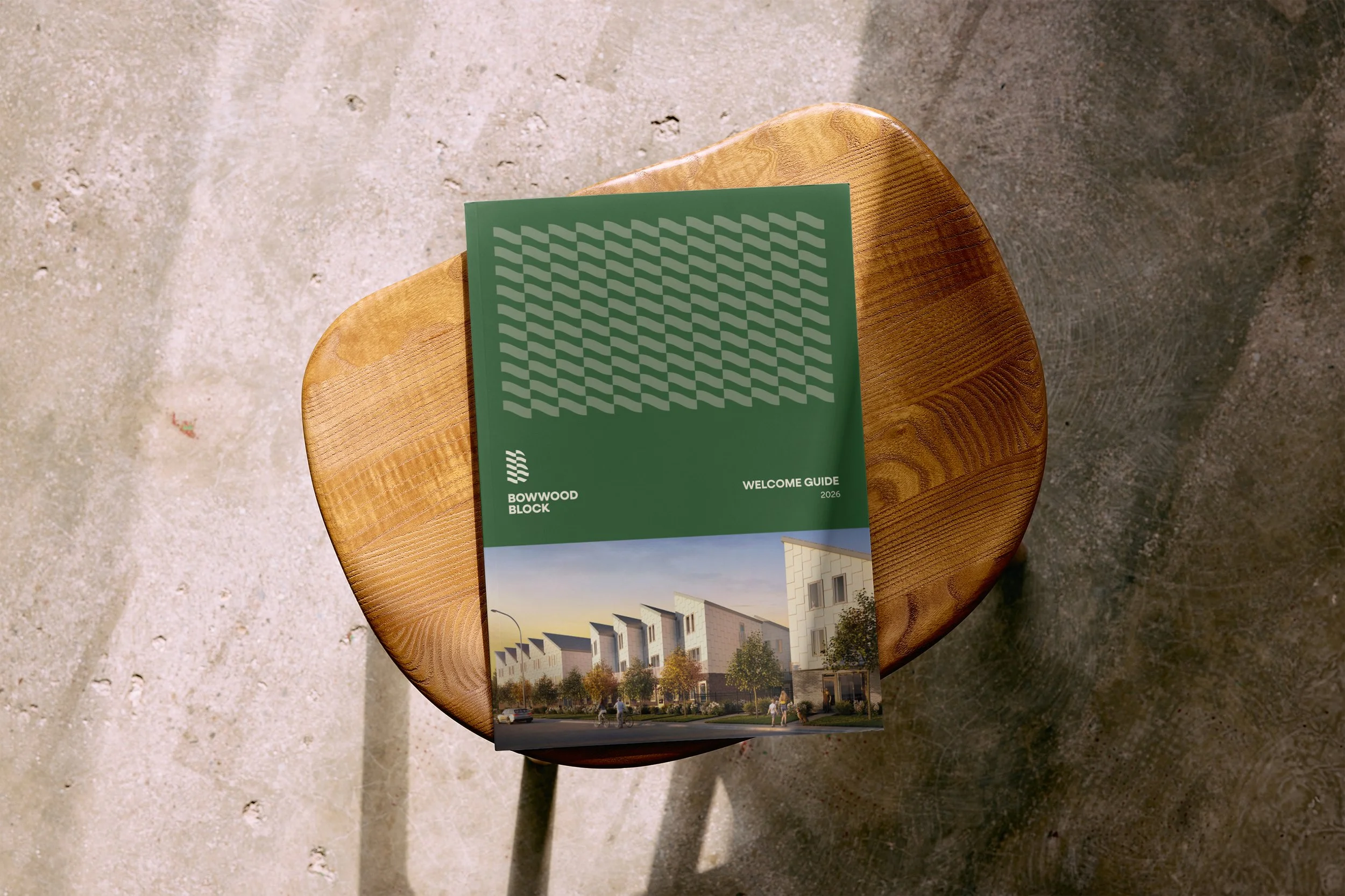
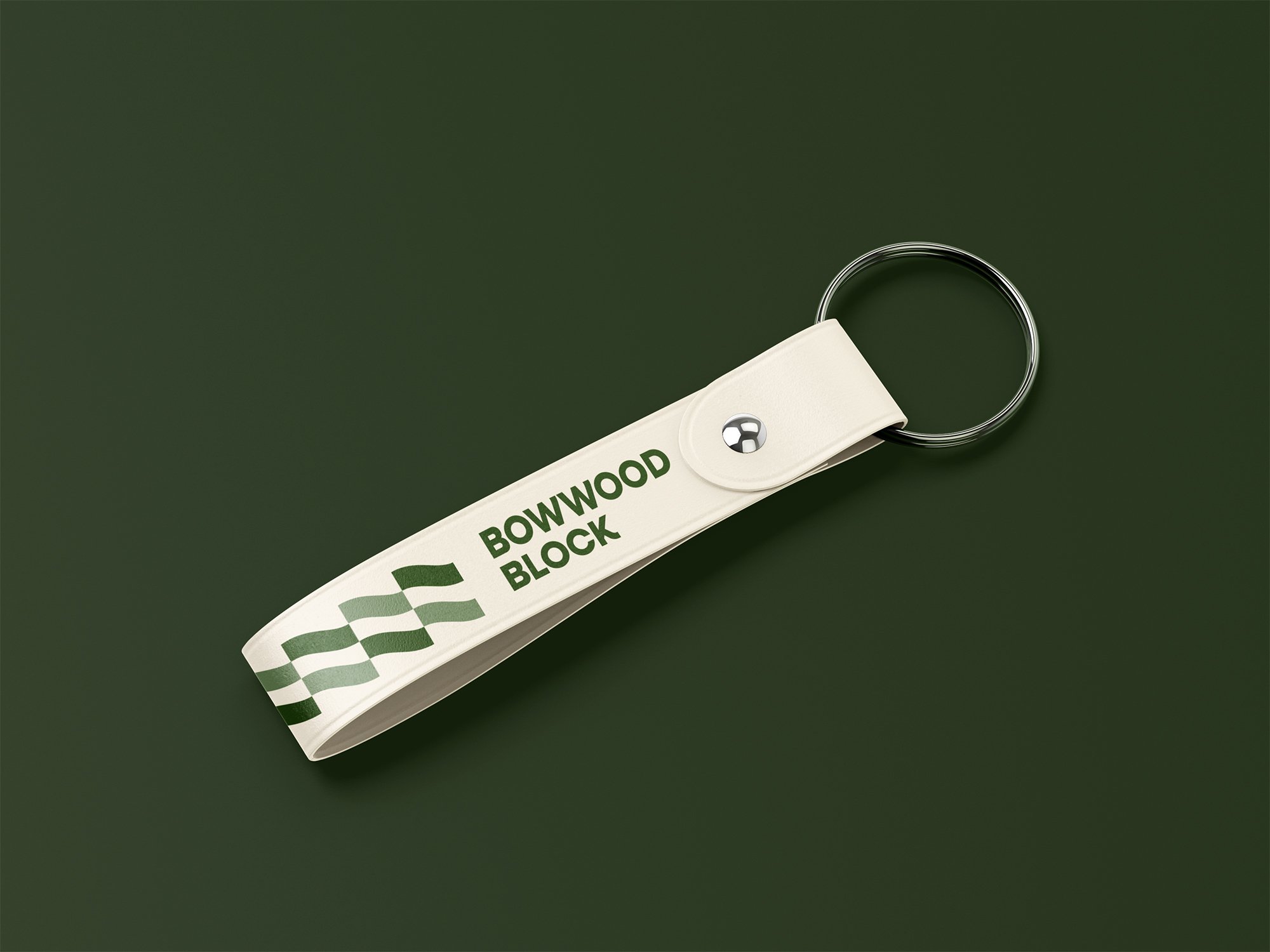
& Bowwood Block
These residential developments integrate nature into everyday living.
By embracing the outdoors, they encourage exploration and connection.
Brief
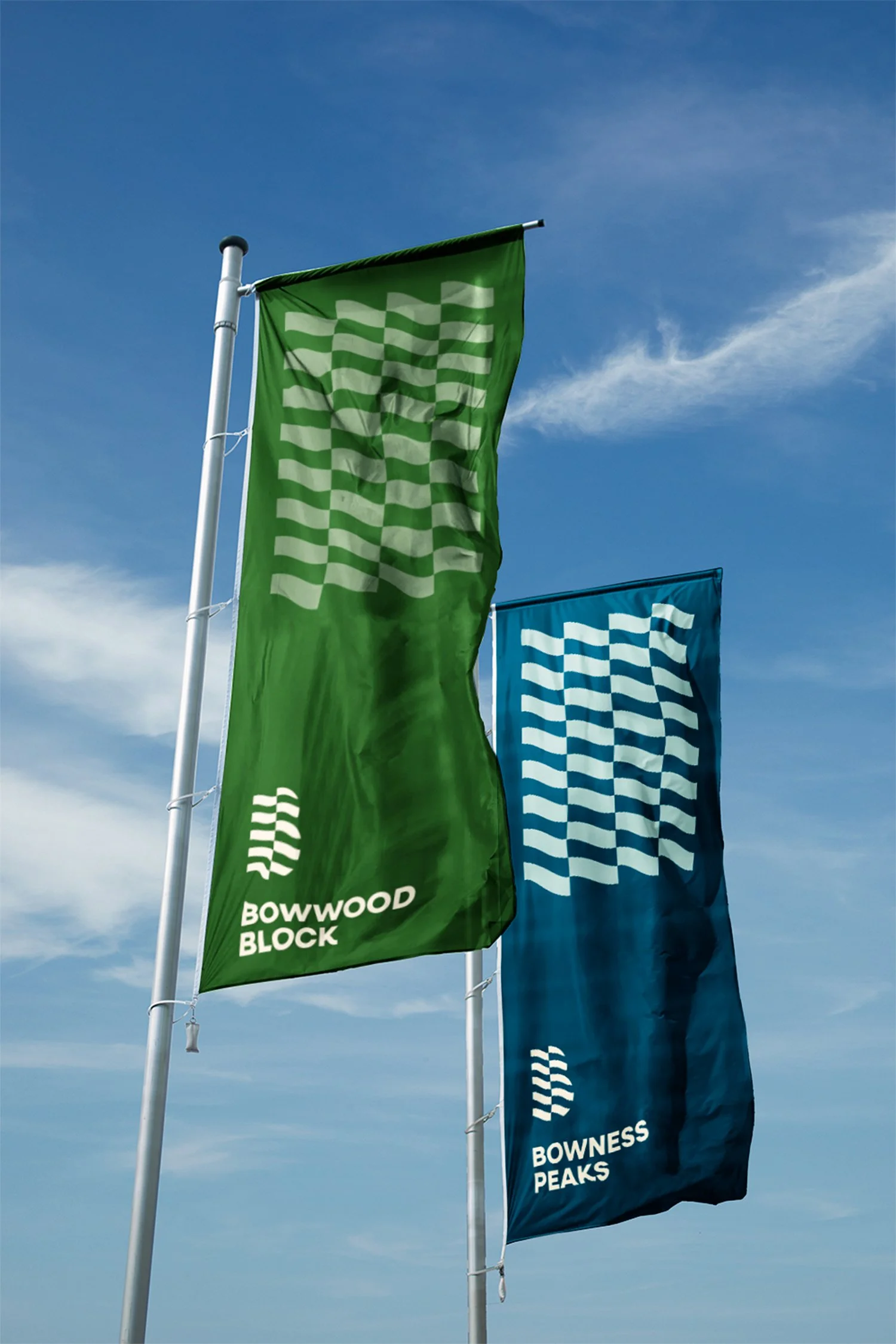
The client sought a unified brandmark to represent both projects under one cohesive identity.
This approach ensures consistency while allowing each project to coexist seamlessly.
They aimed for a distinctive, recognizable form.
One that reflects the character and spirit of the Bowness community.
The Solution
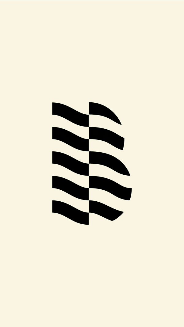
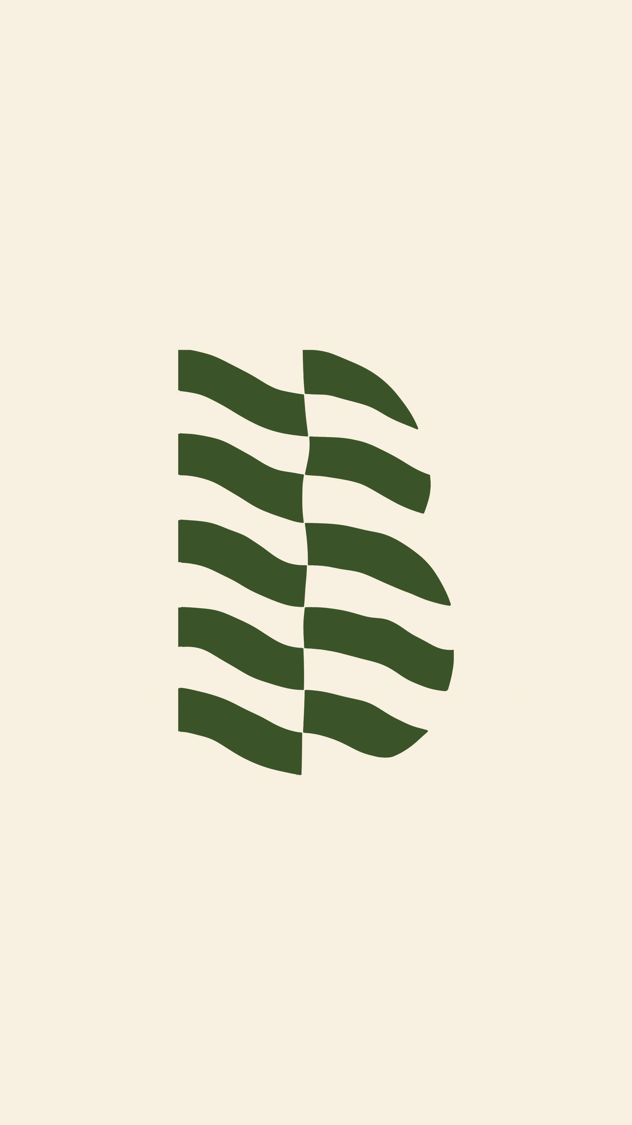
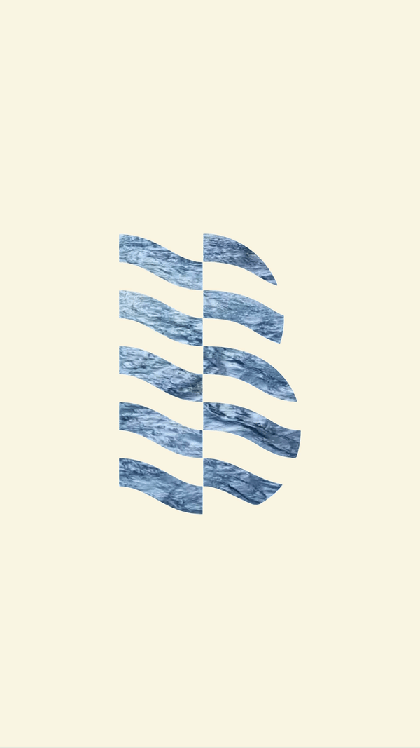
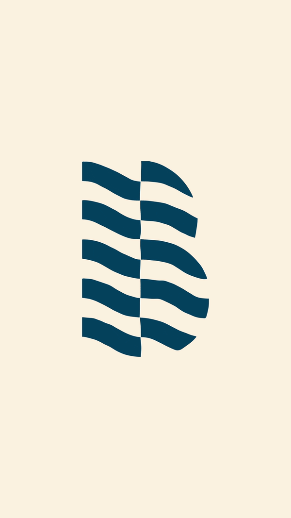
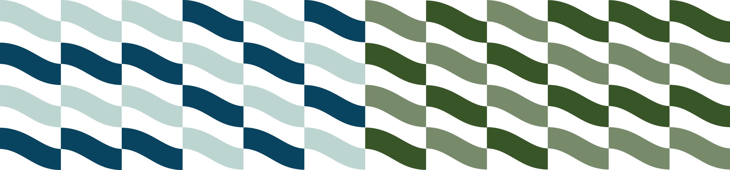
Both projects originate from the letter B — B for Bow River and B for Bowness, the community where they will be located. This alignment presented an opportunity to unify the letter B with the identity of the Bow River, resulting in a brandmark that is distinctive, dynamic, and thoughtfully integrated with its surrounding context.
Scope
Creative Direction, Brand Identity, Art Direction & Digital Design.


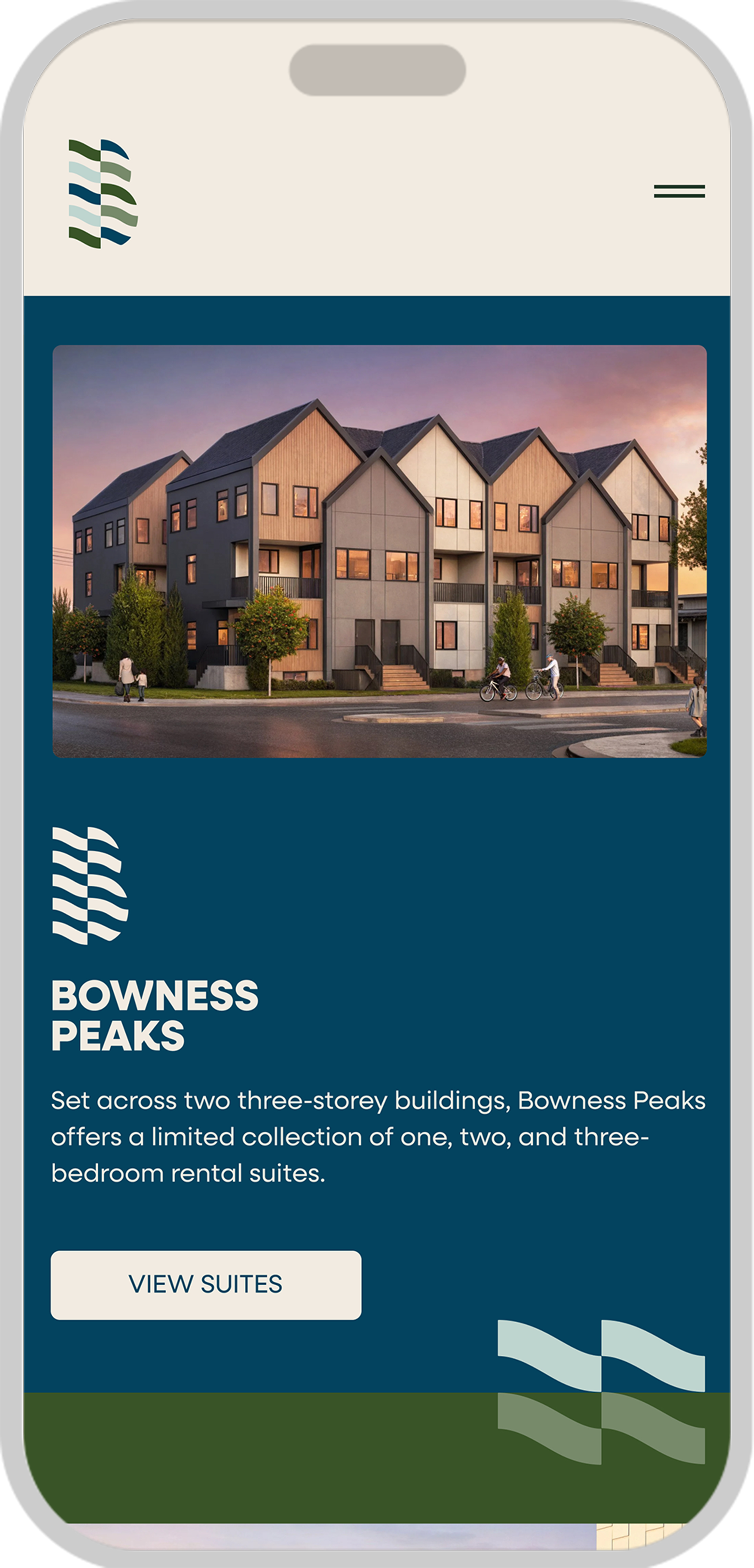
Bowness Peaks
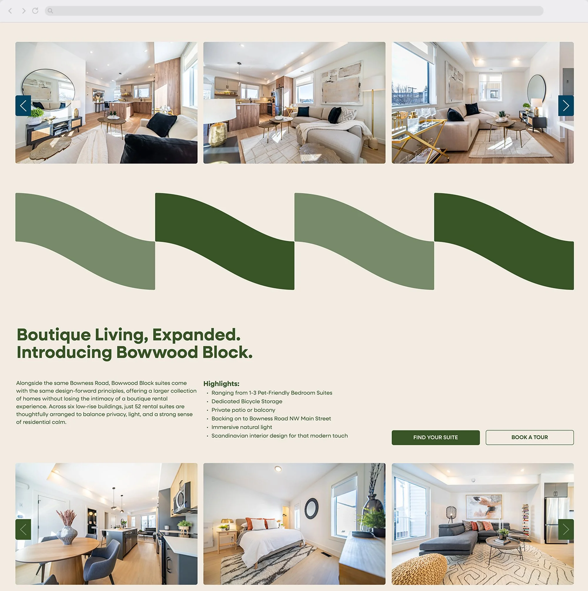
Bowwood Block
Bow River
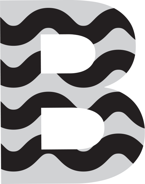
Concept
Brandmark
More Projects